Introduction: the chart is the market's ‘map’
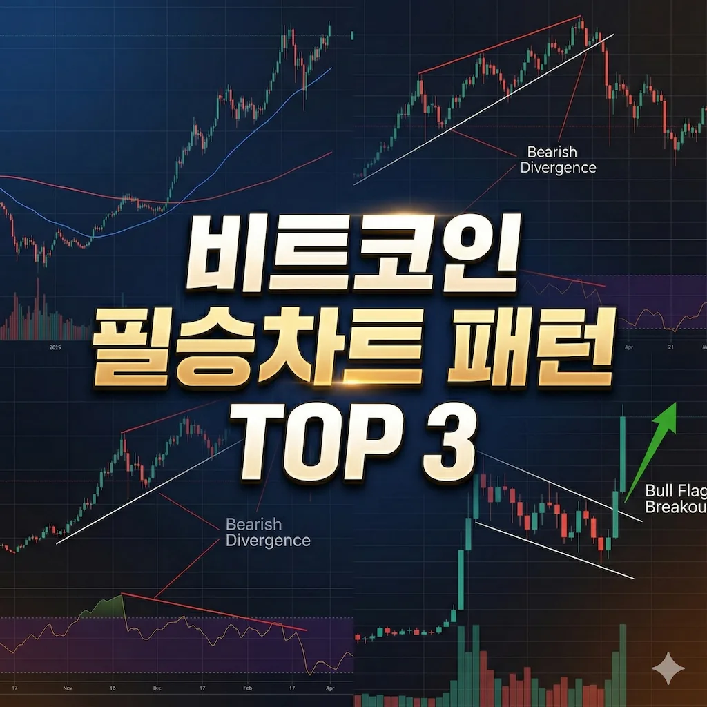
In a market as volatile as Bitcoin, trading on emotion is a shortcut to losses. A chart is the numerical result of countless investors' psychology. You don't need to know every complicated indicator. Here are three core trading methods with the highest win rates that are also the most intuitive.
1. The start and end of major trends: golden cross & death cross
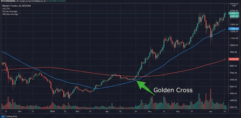
The most classic yet powerful ‘trend confirmation’ indicator. With just two moving averages (MA), you can grasp the market's big flow.
- How it works: When the short-term moving average (50-day line) breaks up through the long-term moving average (200-day line) from below, it's called a **‘Golden Cross’** and seen as a strong buy signal. Conversely, breaking down through it is a **‘Death Cross’**, signaling the start of a decline.
- How to judge: Every major bull market in Bitcoin's history has come after a golden cross. If the gap between the 50-day and 200-day lines is narrowing on the current chart, that's evidence a major inflection point is approaching.
2. A hidden reversal signal: RSI divergence
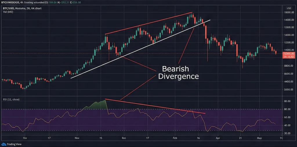
Price is rising but the indicator is falling? This is the most logical way to spot a ‘fake-out.’
- How it works: The RSI (relative strength index) shows whether buying or selling is currently excessive. If price rises to higher highs while the RSI falls to lower highs, it's called a **‘bearish divergence’**. This means upward momentum is exhausted and hints that a crash could come soon.
- How to judge: The direction of the RSI reflects actual strength more accurately than the shape of the candles on the chart. It's essential for checking ‘real strength’ without being fooled by a price rise.
3. The calm before the explosion: the bull flag pattern
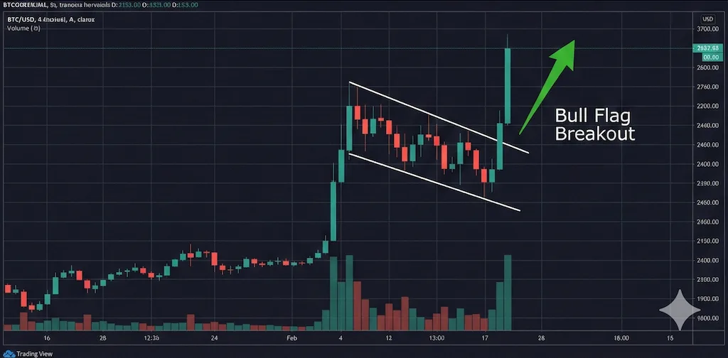
A pattern that lets you forecast the next leg up during a pause after a sharp rally.
- How it works: After a flagpole (a strong vertical rise) forms, the price corrects slightly in the shape of a flag (a downward-sloping sideways box). This pattern is a process of building up energy, and the moment it breaks above the top of the box, there is a very high probability of a further rise equal to the height of the flagpole.
- How to judge: A pattern better suited to maximizing profits in bull markets than in bear markets. If volume shrinks as the flag forms and then surges on the breakout, that's the moment to buy.
Closing: charts are a game of probability
These three techniques are like ‘set plays’ that traders around the world refer to most. But remember that chart analysis is not 100% prediction but **‘betting on high probabilities’**. If you find zones where all three signals overlap (confluence), your win rate will rise dramatically.